For the last ten years, the web has been very "flat." We stripped away shadows, textures, and gradients in favour of 2D simplicity. It was clean, fast, and functional. But there is a problem with flat design: it often feels cheap.
Think about the difference between a plastic dashboard in a budget car and the brushed metal and glass interior of a luxury vehicle. One feels disposable; the other feels substantial. The same logic applies to your digital presence.
In 2026, we are seeing a major shift away from flat design towards Depth and Texture. The leading trend here is Glassmorphism.
What is Glassmorphism?
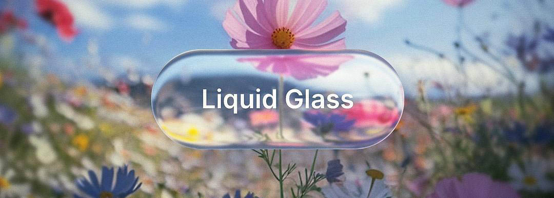
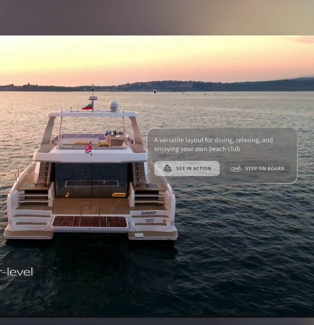
Glassmorphism is a UI style that mimics the look of frosted glass. It uses background blur, semi-transparency, and subtle white borders to create the illusion that elements are floating in 3D space.
You have likely seen it on the latest Apple or Windows interfaces. It looks futuristic, clean, and most importantly, expensive. It signals to your user that this interface was crafted, not just coded.
Why Depth Builds Trust
Why does adding a "frosted glass" effect make a business look more trustworthy? It comes down to Digital Tangibility.
Complexity Equals Competence
In the human brain, we associate texture and depth with quality. A flat grey square is easy to make. A floating, translucent card that blurs the background behind it requires effort and skill. When a potential client sees that level of detail on your site, they subconsciously assume that same attention to detail applies to your service.
Visual Hierarchy
Depth is not just cosmetic; it is functional. By lifting key elements (like your pricing table or your "Book Now" form) off the background using shadow and blur, we tell the user's eye exactly where to look. It creates a sense of order. Flat designs can often feel cluttered because everything is on the same layer. Depth creates clarity.
The "Premium" Association
Because this aesthetic is used heavily by high-end fintech apps and luxury tech brands, adopting it aligns your business with those sectors. It distances you immediately from the "DIY website builder" look, which is typically very flat and rigid.
A Premium Finish for a Premium Service
If you are charging high-ticket prices, your digital storefront needs to feel like a showroom, not a warehouse. Adding depth, texture, and glassmorphism is the final polish that elevates a functional website into a brand asset. Over this month, we have covered Whitespace, Motion, Bento Grids, and now Depth. These are the tools of the "High-Ticket" trade.
Ready for a renovation?
We hope you have enjoyed this deep dive into design psychology. If you are based in Manchester or Droylsden and want to apply these premium principles to your business, JM Digital is ready to help.


" height="16px" id="fOAOY33VM" width="16px"/></svg>)