Open ten different business websites in Manchester right now. I can almost guarantee what you will see on eight of them. First, a big headline in the centre. Then, a "Hero Image" underneath it. Scroll down, and you see three columns of text listing services. Scroll again, maybe a testimonial slider. It is the standard "Bootstrap" layout, and it has plagued the internet for a decade. The problem is not that this layout is broken; the problem is that it is boring. It signals "Template." It tells your potential client: "I bought a £50 theme and changed the logo."
If you are selling high-ticket services, you cannot afford to look like a commodity. You need to look bespoke. Enter the Bento Grid.
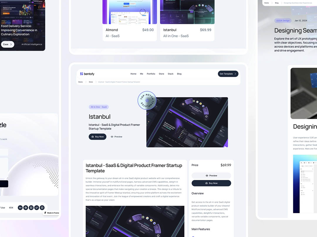
What is a Bento Grid?
Inspired by the Japanese lunchbox (and popularised heavily by Apple’s recent promotional materials), a Bento Grid is a layout style that breaks content into modular, rectangular boxes of different sizes.
Instead of a linear list, it looks like a control panel or a dashboard. It is organised, yet asymmetrical. It feels structured, yet creative. Most importantly, it looks like it was engineered specifically for you, not just downloaded from a theme store.
Why the Grid Signals Value
The Bento Grid is currently the gold standard for high-tech and high-value brands. Here is why switching to this layout changes the perception of your business:
Information Density without Clutter
High-level consultants often have a lot to say. A standard layout forces you to write long paragraphs that nobody reads. A Bento Grid forces you to compartmentalise. You can have a box for "Social Proof," a box for "Key Metric," and a box for "Core Service," all visible at once without overwhelming the eye. It respects the user's intelligence.
Mobile Superiority
We live in a mobile-first world. The beauty of the Bento Grid is that these boxes stack perfectly on a phone screen. While standard templates often break or look weird on mobile, Bento layouts feel like native apps. They feel responsive and tactile, like using a high-end piece of software.
The "Apple" Effect
Because this style is heavily used by tech giants like Apple and Microsoft, consumers subconsciously associate it with innovation and premium quality. By adopting this visual language, you borrow that authority. You signal that your business is modern, forward-thinking, and technologically literate.
Stand Out in the Sea of Sameness
In a crowded market like the North West, distinctiveness is a business asset. If a prospect opens your competitor’s site and sees the "Same Old Template," and then opens yours to see a sleek, custom Bento interface, you have already won the battle of first impressions. Do not let a generic template devalue your premium service.
Time to break the mould?
If you want a website that looks like it was built, not just bought, let’s talk. We can design a custom interface that showcases your services in a way that demands attention.


" height="16px" id="fOAOY33VM" width="16px"/></svg>)